TV's Golden Age (Tidy Tuesday Jan 7, 2019)
Purpose
The purpose of this post is to explore the Tidy Tuesday TV’s Golden Age project.
Background
This Tidy Tuesday topic was inspired by an article in The Economist. Here they make the point that ratings have only modestly increased since the 1990s, and that the notion of a new “Golden Age” of TV is illusory. They’ve made a few points:
- There are more good shows, but that’s because there are more shows, not because we’ve gotten better
- Good shows have more ratings
- TV is apparently having another golden age, on the basis of increasing ratings
Setup
We load a few libraries for our analysis. We’ll be using the tidyverse suite of tools to examine, you know, Tidy Tuesday.
library(tidyverse)
library(lubridate)
library(stringr)
library(DT)
Data
The raw data is here. It was downloaded into the raw data directory.
A data dictionary was included, but is fairly light.
Importing
The data was imported using the defaults of read_csv.
ratings_raw <- read_csv("data/IMDb_Economist_tv_ratings.csv")## Parsed with column specification:
## cols(
## titleId = col_character(),
## seasonNumber = col_double(),
## title = col_character(),
## date = col_date(format = ""),
## av_rating = col_double(),
## share = col_double(),
## genres = col_character()
## )A few observations about this dataset:
titleIdandtitlematch one for one. I don’t need to merge this dataset with anything else, so I ignoretitleId.genresis a comma separated list of different genres for the TV show. This is a bit frustrating to deal with, but this Stack Overflow page has everything you want to know for dealing with this data type. I stuck to thetidyrseparate_rowsfunction (in theratings_genresdataset below) to handle this situation.- More on
genres: the first in the comma-separated list appears to be a primary genre. I put this into the primary dataset.
All the genres in this dataset are as follows:
str_split(ratings_raw$genres, ",", simplify = FALSE) %>% do.call(c, .) %>% unique()## [1] "Drama" "Mystery" "Sci-Fi" "Adventure" "Action"
## [6] "Crime" "Fantasy" "Family" "Romance" "Comedy"
## [11] "Thriller" "Biography" "Horror" "Music" "Sport"
## [16] "History" "Documentary" "Animation" "Western" "War"
## [21] "Reality-TV" "Musical"All the primary genres are as follows:
map_chr(ratings_raw$genres, ~ unlist(str_split(.x, ","))[1]) %>% unique()## [1] "Drama" "Adventure" "Action" "Comedy" "Crime"
## [6] "Biography" "Animation" "Documentary"There are only a few genres that are considered primary. This is interesting, and becomes important later.
Munging
It’s important to realize that a lot of this code was written after the analysis below. For instance, I realized that the year, number of seasons, and primary genre would be useful for a number of analyses after looking at some of the analyses below.
ratings <- ratings_raw %>%
  mutate(year = year(date),
         primary_genre = map_chr(genres, ~ unlist(str_split(.x, ","))[1])) %>%
  group_by(title) %>%
  mutate(n_seasons = max(seasonNumber), last_season = max(year)) %>%
  ungroup()

ratings_genres <- ratings %>%
  separate_rows(genres, sep = ",")
Basic exploration
First we look at the head.
head(ratings)## # A tibble: 6 x 11
## titleId seasonNumber title date av_rating share genres year
## <chr> <dbl> <chr> <date> <dbl> <dbl> <chr> <dbl>
## 1 tt2879~ 1 11.2~ 2016-03-10 8.49 0.51 Drama~ 2016
## 2 tt3148~ 1 12 M~ 2015-02-27 8.34 0.46 Adven~ 2015
## 3 tt3148~ 2 12 M~ 2016-05-30 8.82 0.25 Adven~ 2016
## 4 tt3148~ 3 12 M~ 2017-05-19 9.04 0.19 Adven~ 2017
## 5 tt3148~ 4 12 M~ 2018-06-26 9.14 0.38 Adven~ 2018
## 6 tt1837~ 1 13 R~ 2017-03-31 8.44 2.38 Drama~ 2017
## # ... with 3 more variables: primary_genre <chr>, n_seasons <dbl>,
## # last_season <dbl>The number of rows is
nrow(ratings)## [1] 2266This is the number of ratings, and the number of shows is
ratings %>%
  group_by(title) %>%
  slice(1) %>%
  ungroup() %>%
  nrow()
## [1] 868The number of seasons can be shown by
ratings %>%
  count(title) %>%
  ggplot(aes(n)) +
  geom_bar()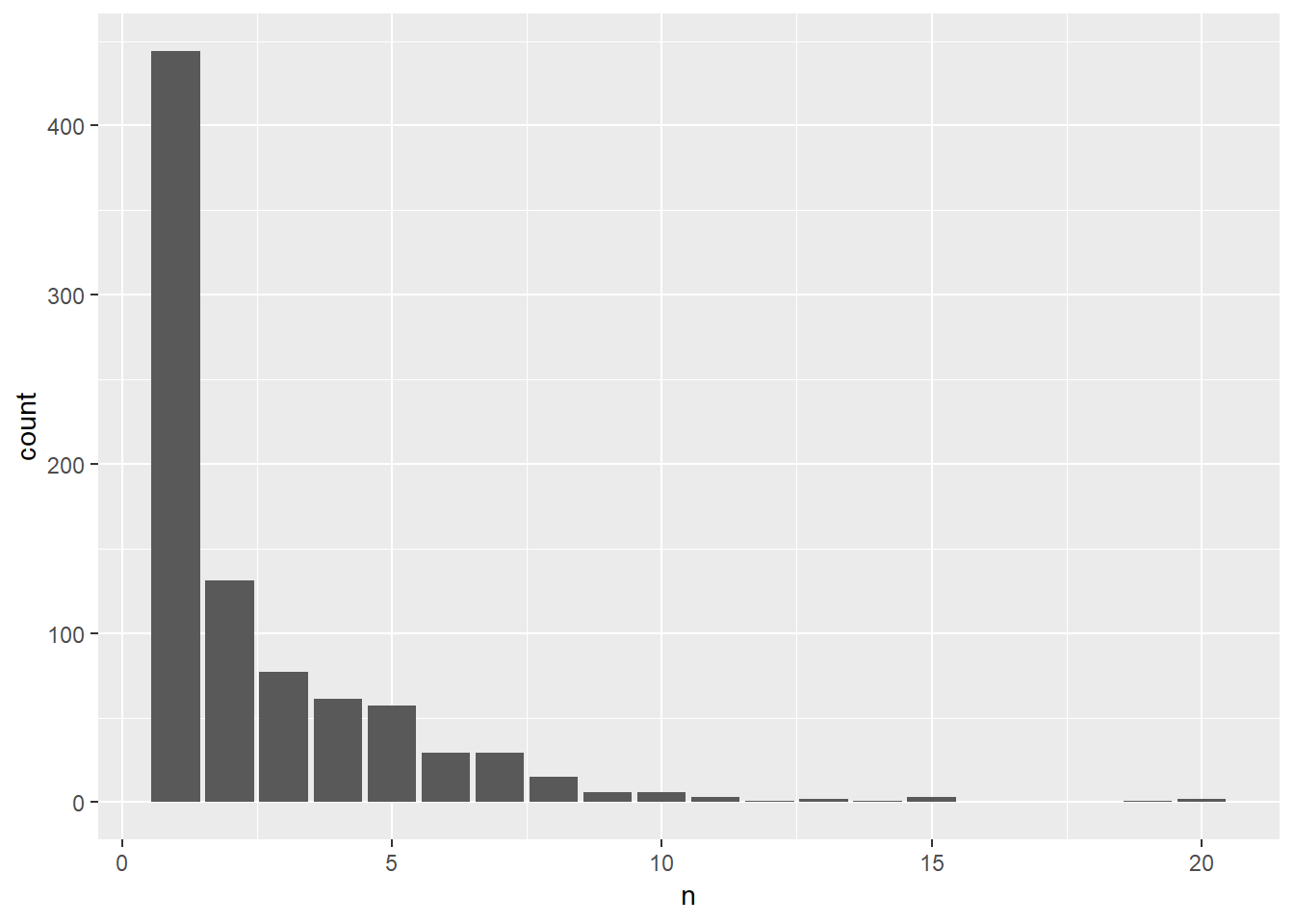
I had done a histogram, but because this is discrete, a bar chart is better. Most shows survive a season, and the number of survivors of a given number of seasons drops off apparently through a power law.
Ratings
The first order of business with analyzing ratings data is to look at ratings over time:
ratings %>%
  ggplot(aes(year, av_rating)) +
  geom_point() +
  geom_smooth(se = FALSE, color = "purple") +
  geom_smooth(method = "lm", se = TRUE) +
  labs(x = "Year", y = "Average rating")
## `geom_smooth()` using method = 'gam' and formula 'y ~ s(x, bs = "cs")'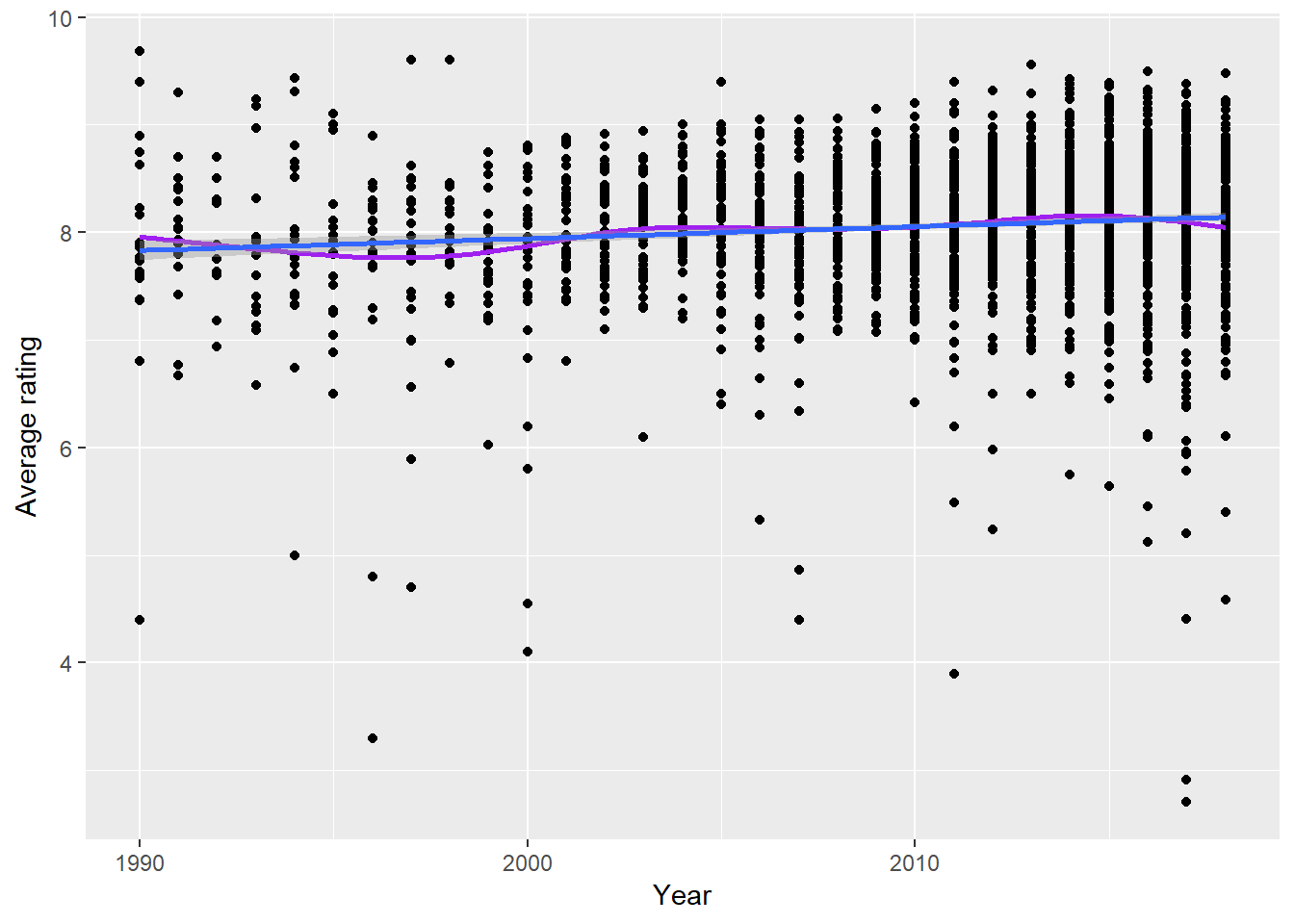
Ratings considering show. We eliminate the legend because that would just clutter up the graph. However, you might use a package like gghighlight (not shown here) to point out particular shows if you wish.
ratings %>%
  ggplot(aes(year, av_rating, color = title)) +
  geom_point() +
  geom_line() +
  labs(x = "Year", y = "Average rating") +
  guides(color = "none")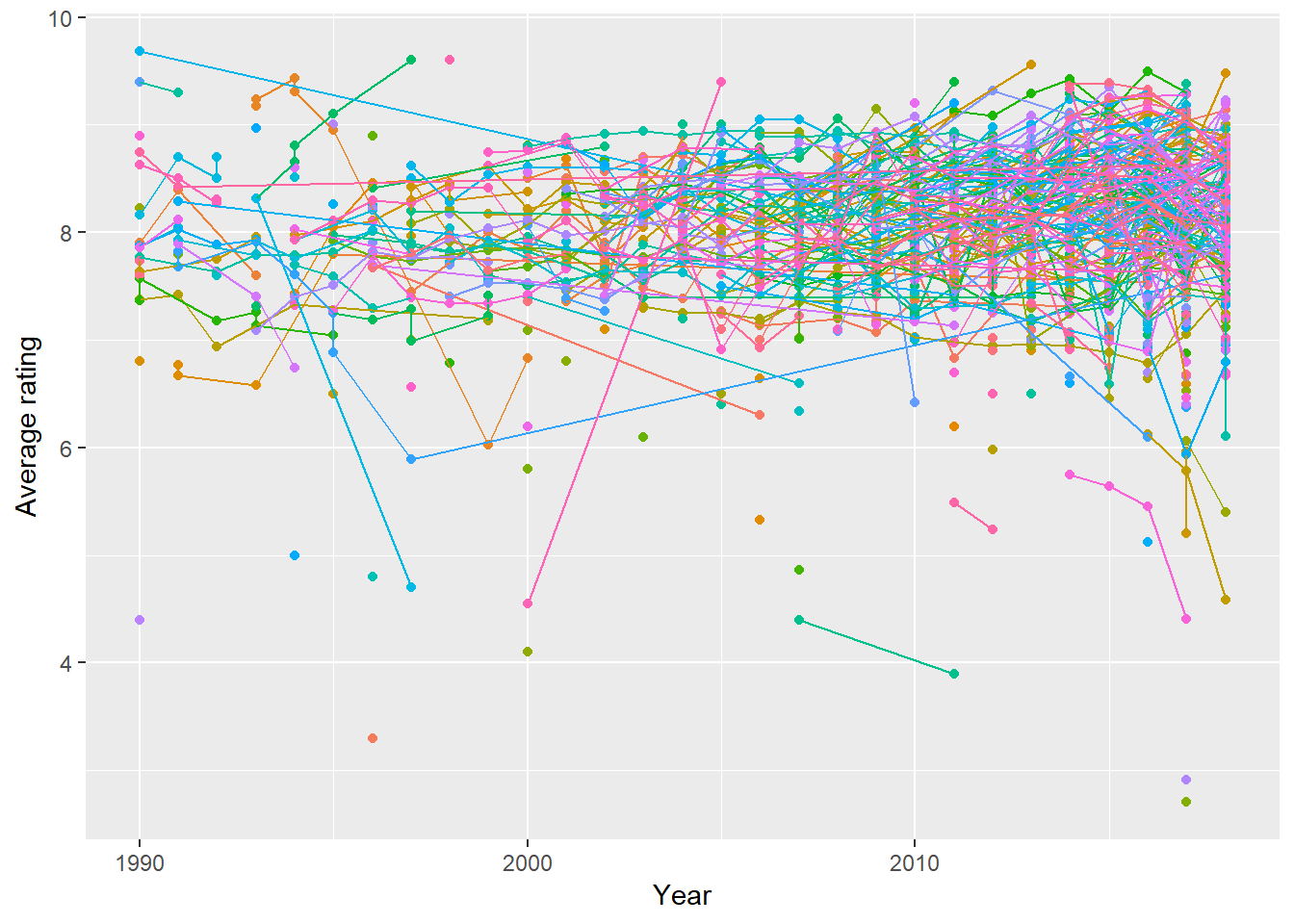
Shows that have low ratings might get canceled. I explore this hypothesis below. What is the average of average rating by number of seasons?
ratings %>%
  filter(last_season < 2018) %>%
  group_by(title) %>%
  summarize(av_rating = mean(av_rating), n_seasons = n_seasons[1]) %>%
  ungroup() ->
  season_rating

season_rating %>%
  arrange(desc(av_rating))
## # A tibble: 694 x 3
## title av_rating n_seasons
## <chr> <dbl> <dbl>
## 1 Touched by an Angel 9.6 5
## 2 Santa Barbara 9.4 1
## 3 L.A. Law 9.35 5
## 4 Game of Thrones 9.27 7
## 5 The Fugitive Chronicles 9.2 1
## 6 Person of Interest 9.12 5
## 7 The Leftovers 9.06 3
## 8 Wentworth 9.05 5
## 9 TURN: Washington's Spies 9.02 4
## 10 Outlander 9.02 3
## # ... with 684 more rowsseason_rating %>%
filter(n_seasons < 15) %>%
ggplot(aes(av_rating, n_seasons)) +
geom_point() +
geom_smooth(method = "lm", se = FALSE) +
labs(x = "Average average rating", y = "Number of seasons") +
ggtitle("Shows ending before 2018")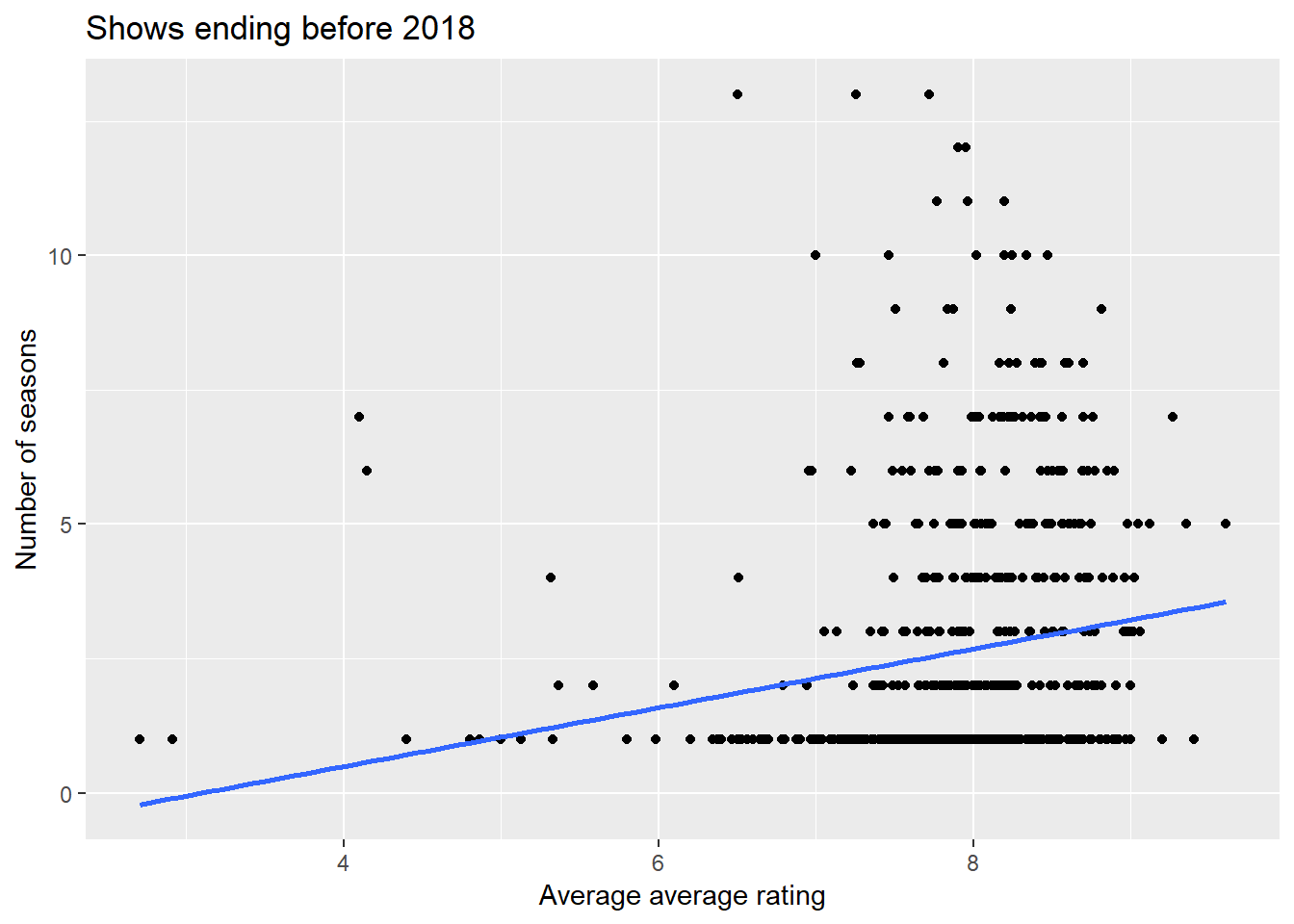
The up trend line matches our hypothesis, but is probably overstating the case a bit. This is due to the fact that there are too few points with very low ratings, and so they are high leverage and give undue influence to the slope of the trend line. The fact that the number of seasons is discrete with just a few outcomes, well, this trend line is just a guide anyway, right?
If a show declines in average ratings over time too much, they might cancel the show. So let’s look at the trend in ratings by number of seasons run. There are a couple of caveats. First, I don’t consider shows that are still running, because my hypothesis is about shows that have run their course, although I decided to consider long-running shows that are not yet canceled (thus the odd-looking filter). In this analysis, I want to give a show a chance to be successful if it is still ongoing. Second, I use the good ole standby lm to assess trend over time. Do positive slopes in ratings correspond to number of seasons?
ratings %>%
  filter(n_seasons > 2 | (last_season < 2018 & n_seasons > 5)) %>%
  group_by(title, n_seasons) %>%
  nest() %>%
  mutate(rating_lm = map(data, ~ lm(av_rating ~ seasonNumber, data = .x))) %>%
  mutate(slope = map_dbl(rating_lm, ~ coef(.x)[2])) %>%
  select(title, n_seasons, slope) %>%
  ungroup() %>%
  na.omit() ->
  seasons_slope

seasons_slope %>%
  arrange(desc(n_seasons))
## # A tibble: 302 x 3
## title n_seasons slope
## <chr> <dbl> <dbl>
## 1 Polizeiruf 110 44 -0.0474
## 2 Masterpiece Classic 37 -0.114
## 3 Law & Order 20 -0.00102
## 4 Law & Order: Special Victims Unit 20 -0.0413
## 5 Midsomer Murders 19 -0.0247
## 6 CSI: Crime Scene Investigation 15 -0.0657
## 7 ER 15 -0.00633
## 8 Grey's Anatomy 15 -0.0391
## 9 Criminal Minds 14 0.0431
## 10 Columbo 13 -0.0444
## # ... with 292 more rowsseasons_slope %>%
arrange(desc(slope))## # A tibble: 302 x 3
## title n_seasons slope
## <chr> <dbl> <dbl>
## 1 Third Watch 6 0.97
## 2 Zoey 101 4 0.850
## 3 Greek 4 0.636
## 4 The Expanse 3 0.464
## 5 8 Simple Rules 3 0.452
## 6 Friday Night Lights 5 0.450
## 7 BoJack Horseman 5 0.397
## 8 The Walking Dead: Webisodes 3 0.345
## 9 Kingdom 3 0.341
## 10 Defiance 3 0.335
## # ... with 292 more rowsseasons_slope %>%
ggplot(aes(n_seasons, slope)) +
geom_point() +
geom_smooth(method = "lm", se = FALSE) +
labs(x = "Number of seasons", y = "Trend in ave ratings")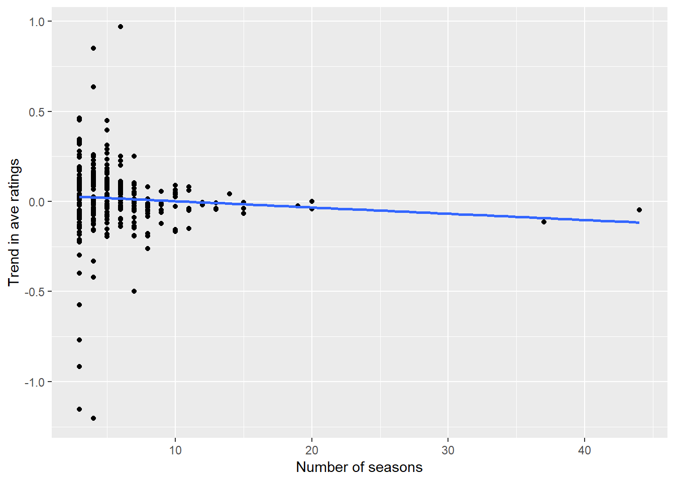
The slight decline is probably not much to get excited about. The two points out at 40 seasons are high leverage and seem to drag the slope down unduly. I would say there is not a lot of useful trend in the ratings trajectory and the number of seasons. Then again, the fact that most shows are 1 or 2 seasons long confounds this analysis.
Genres
How many TV shows per year in each genre?
ratings_genres %>%
  count(year, genres) %>%
  ggplot(aes(year, n, group = genres, color = genres)) +
  geom_line() +
  labs(x = "Year", y = "Number in genre on TV")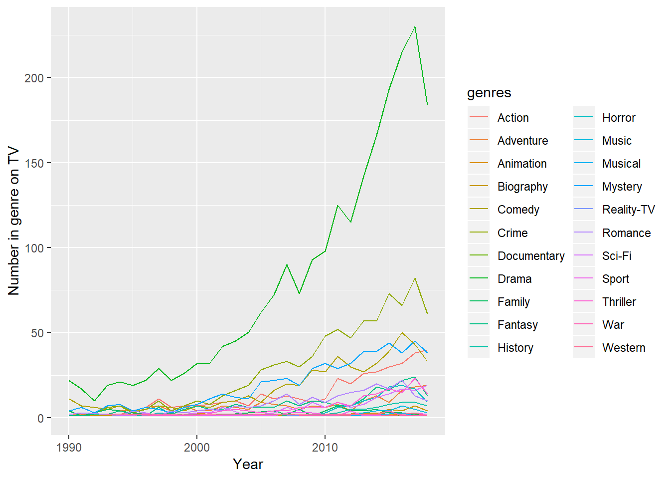
There really isn’t a good denominator for these numbers, because a show can have one or five different genres. But it is interesting the number of producers who think people want to watch dramas.
I repeat the analysis by primary genre.
ratings %>%
  count(year, primary_genre) %>%
  ggplot(aes(year, n, group = primary_genre, color = primary_genre)) +
  geom_line() +
  labs(x = "Year", y = "Number in genre on TV")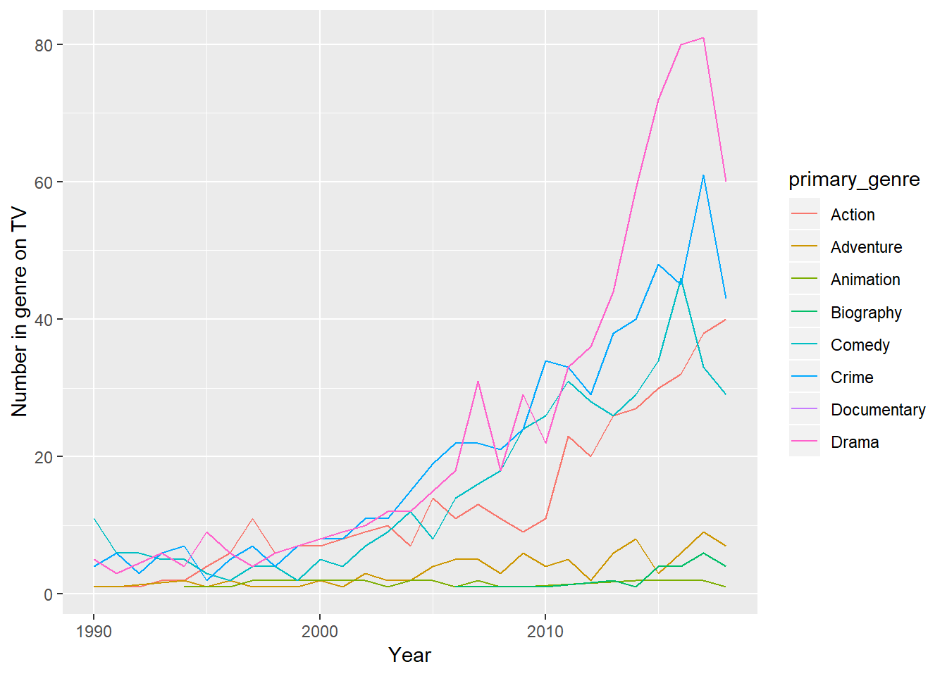
Here it looks like action shows dominate, followed by comedy and crime, though drama is trending up. Maybe the difference between dramas here and above is that producers want to tag their shows with “drama” to make it seem more enticing? ¯_(ツ)_/¯
I wonder if there are certain genres that are more popular than others, so I present ratings by by primary genre:
ratings %>%
  group_by(year, primary_genre) %>%
  summarize(av_rating = mean(av_rating)) %>%
  ggplot(aes(year, av_rating, color = primary_genre, group = primary_genre)) +
  geom_point() +
  geom_line() +
  scale_color_viridis_d() +
labs(x = "Year", y = "Average rating") 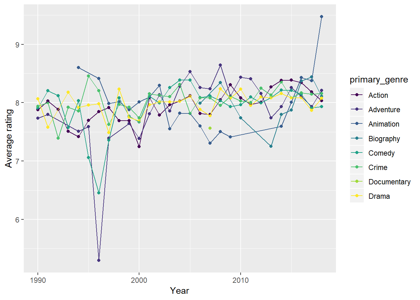
With the exception of a few outliers during some years, these really are a jumble. I wouldn’t make too much of the spikes in any given year, including 2018.
Ratings aren’t the only measure of a show’s success. Shows that run a long time (like NCIS) might be considered successful. Which genres have the longest-running shows over time? Here I present the number of shows running at least a given number of seasons by genre, over time. This is somewhat complicated to calculate, and I do it in a somewhat clunky way. As it turns out, only action, comedy, crime, and drama have interesting data (the rest have very few shows), so I filter out below to make this dense graph more readable. An interesting case study would be Sesame Street, which has fairly low ratings but a very long running time.
ratings %>%
  group_by(year, primary_genre) %>%
  nest() %>%
  mutate(nseas_df = map(data, ~ data.frame(seasons = 1:10, n_shows = map_dbl(1:10, function(y) sum(.x$seasonNumber >= y))))) %>%
  select(-data) %>%
  unnest() %>%
  ungroup() %>%
  arrange(year, primary_genre, seasons) ->
  seasons_year

seasons_year %>%
  filter(primary_genre %in% c("Action", "Comedy", "Crime", "Drama")) %>%
  ggplot(aes(seasons, n_shows)) +
  geom_bar(stat = "identity") +
  facet_grid(primary_genre ~ year) +
  labs(x = "Seasons", y = "Number of shows") +
  scale_x_discrete(labels = c(1,10))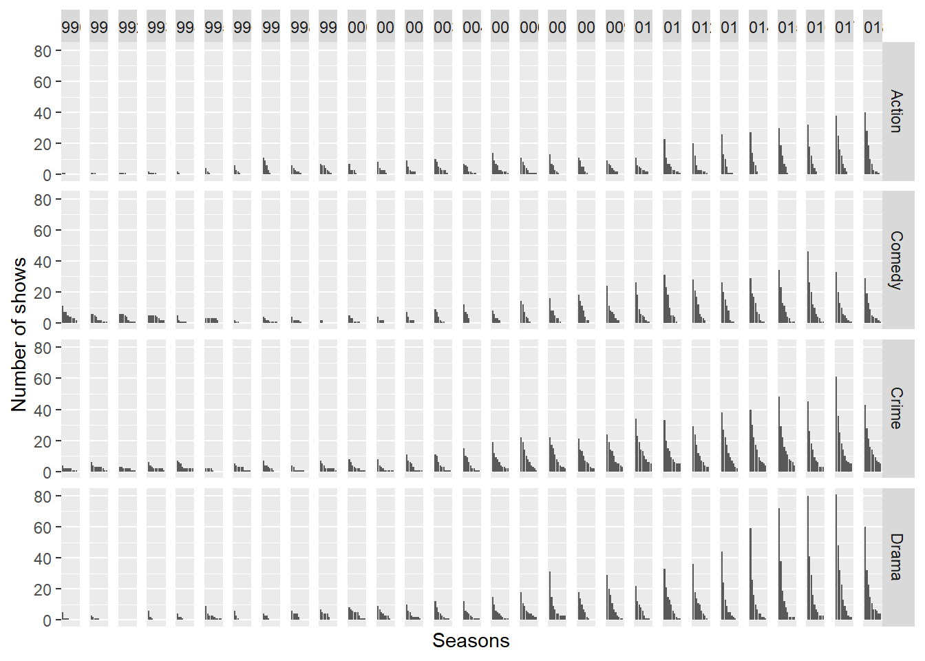
This graph is packed with information. First, it’s clear that there are a lot more shows over time. Second, comedy fades out in the late 90s and gives way to action shows, but then makes a strong comeback. Crime shows seem to be the most consistent, presumably because of long-running shows like NCIS or Law and Order (and their myriad spinoffs). On the other hand, a lot of the recent dramas fail in or after their first season, usually moreso than the other three genres (to see this, look at the difference between season 1 and 2 bars, consistently over time).
Other directions
There’s a lot more that can be done with this dataset, but I’m looking forward to seeing what others do with it.