Prison rate
Purpose
In continuing with Tidy Tuesday analysis, I do a very short post based on the prison rate dataset. Because time was short, I only did a couple of quick visualizations. There is a lot to this rich dataset, and this is only going to be a drop in the bucket. In fact, I don’t even download all of the files (for the purpose of this blog post). Really this was a chance to dip my toes in ggplot2’s geom_sf, which makes plotting maps a lot simpler than it used to me.
Setup
library(tidyverse)
library(tigris)
library(gganimate)
Get data
Here I get data from two sources. First is the Tidy Tuesday website. The second is map geometry from the tigris package. The tigris package was updated some time ago to be compatible with the simple features sf package, making map plotting a lot smoother.
prison_pop <- read_csv("https://raw.githubusercontent.com/rfordatascience/tidytuesday/master/data/2019/2019-01-22/prison_population.csv")

state_sf <- states(class = "sf")
Munge and present data
The prison_pop dataset is at the county level, and, if I had wanted to, I could have merged it with the results of states(class = "sf") and produced a choropleth map that way. However, I aimed high and wanted to do an animated map. It takes a long time to do that, so I’ll summarize data at the state level. I’ll also produce a quick static map.
prison_pop %>%
  group_by(year, state, pop_category) %>%
  summarize(population = sum(population, na.rm = TRUE),
            prison_population = sum(prison_population, na.rm = TRUE)) %>%
  mutate(prison_rate = prison_population / population * 100000) %>%
  ungroup() ->
  state_prison_pop


state_sf %>%
  left_join(state_prison_pop, by = c("STUSPS" = "state")) ->
  state_prison_map

state_prison_map %>%
  filter(year == 2000, pop_category == "Total", !STUSPS %in% c("AK", "HI")) %>%
  ggplot() +
  geom_sf(aes(fill = prison_rate)) +
  labs(title = "Prison rate for Year 2000")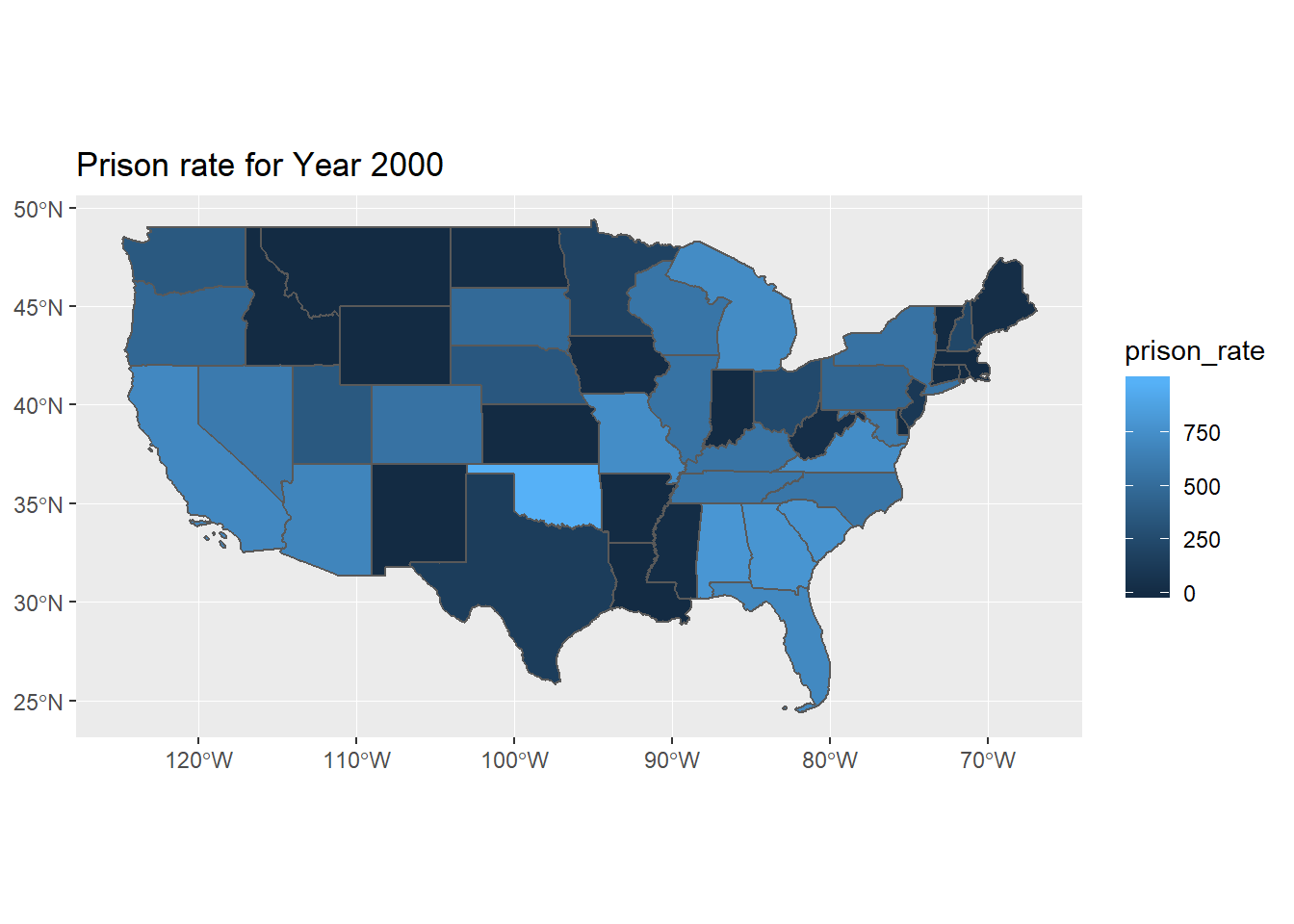
What I really want to do, and the crowning achievement of this post, is the above, but animated throughout all years. It’s pretty easy with the new version of the gganimate package. Here’s the code, though I’ve pre-rendered the file for this blog post. This takes a pretty long time even on my beefy system. I’ve also cut out our compatriots to the northwest and southwest, and at some point I might try learning the inset tricks.
state_prison_map %>%
  filter(pop_category == "Total", !STUSPS %in% c("AK", "HI"))  %>%
  ggplot() +
  geom_sf(aes(fill = prison_rate)) +
  transition_time(as.integer(year)) +
  labs(title = "Year: {frame_time}") +
  theme_void()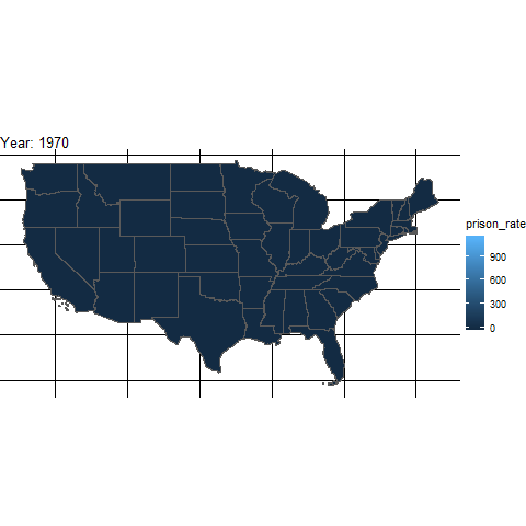
Prison rates through the years by state
That’s it for now. Short and sweet.