Housing prices and mortgage rates
Purpose
This Tidy Tuesday looks at housing prices and mortgage rates. It also considers recessions. I show one way of merging all this data below.
The R4DS post for the challenge can be found here.
Setup
Get data
state_hpi <- readr::read_csv("https://raw.githubusercontent.com/rfordatascience/tidytuesday/master/data/2019/2019-02-05/state_hpi.csv")## Parsed with column specification:
## cols(
## year = col_double(),
## month = col_double(),
## state = col_character(),
## price_index = col_double(),
## us_avg = col_double()
## )mortgage_rates <- readr::read_csv("https://raw.githubusercontent.com/rfordatascience/tidytuesday/master/data/2019/2019-02-05/mortgage.csv", col_types = "Ddddddddd")Recession dates from the Wikipedia article. I downloaded the data from the Tidy Tuesday page, but I couldn’t do a lot with it. So I took the code from the SPOILERS section of the page and modifed it. Mostly, I added the tidyr::extract code so I could determine the year and month of the starts and ends of the recessions, and then converted them to dates. It will make a nice underlay on the time series plots.
url <- "https://en.wikipedia.org/wiki/List_of_recessions_in_the_United_States"

df3 <- url %>%
  read_html() %>%
  html_table() %>%
  .[[3]] %>%
  janitor::clean_names()

recession_dates <- df3 %>%
  mutate(duration_months = substring(duration_months, 3),
         period_range = substring(period_range, 5),
         time_since_previous_recession_months = substring(time_since_previous_recession_months, 4),
         peak_unemploy_ment = substring(peak_unemploy_ment, 5),
         gdp_decline_peak_to_trough = substring(gdp_decline_peak_to_trough, 5),
         period_range = case_when(name == "Great Depression" ~ "Aug 1929-Mar 1933",
                                  name == "Great Recession" ~ "Dec 2007-June 2009",
                                  TRUE ~ period_range)) %>%
  tidyr::extract(period_range, c("from_c","to_c"), "([[^-]]+)-([[^-]]+)") %>%
  mutate(from = as.Date(parse_date_time(from_c, "%b %Y")),
         to = as.Date(parse_date_time(to_c, "%b %Y")))
Munging data
First we look a the housing price index: > The House Price Index (HPI) is a broad measure of the movement of single-family house prices. The HPI is a weighted, repeat-sales index, meaning that it measures average price changes in repeat sales or refinancings on the same properties. This information is obtained by reviewing repeat mortgage transactions on single-family properties whose mortgages have been purchased or securitized by Fannie Mae or Freddie Mac since January 1975. - Quote from Federal Housing Finance Agency
This HPI is scaled so that each state has 100 in Dec 2000. So each data point is the percent of the Dec 2000 price in that state. If you visualize this, there is a nexus at Dec 2000 that I find undesirable, although analysis can still occur with it. So I do a price reindex by dividing by the first (Jan 1975) HPI, so that we start off at 100. Then the reindex is just the percent of the first data point. It makes the graphs look better, and is mathematically equivalent.
state_hpi %>%
  mutate(date = ymd(year*1e4 + month*1e2 + 1)) %>%
  group_by(state) %>%
  mutate(price_reindex = price_index / price_index[1] * 100, us_reavg = us_avg / us_avg[1] * 100) %>%
  ungroup() ->
  state_hpi
HPI
Here are the housing price indexes for each state. There’s a peculiar superlative since 2000 with DC.
state_hpi %>%
  ggplot() +
  geom_line(aes(date,price_reindex / us_reavg, group = state, color = state)) +
  geom_rect(aes(xmin = from, xmax = to, ymin = -Inf, ymax = Inf), alpha = 0.25, fill = "black",
            data = recession_dates) +
  xlim(ymd(19750101), NA) +
  ylab("HPI / US avg HPI\nreindexed to Jan 1975 = 100")
## Warning: Removed 9 rows containing missing values (geom_rect).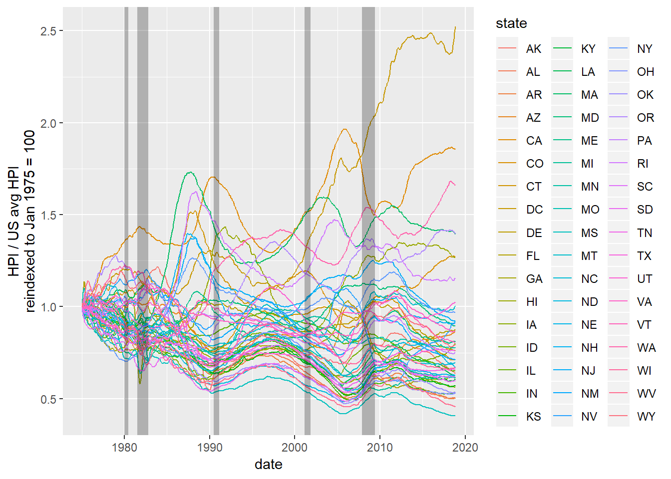
Highest HPI by year and month
This is to confirm the state with the maximum for each time point. Keep in mind this is not raw housing prices (where we would need a cost of living index), but rather growth in prices relative to a given point in time (doesn’t matter when, I just use the Dec 2000 date here). In the late nineties HI had a bubble in housing, which settled back down. Since 2000, DC has experienced huge increase in housing pricing relative to the rest the country.
state_hpi %>%
  group_by(year,month) %>%
  top_n(1, price_index) %>%
  ungroup() %>%
  arrange(year, month)
## # A tibble: 577 x 8
## year month state price_index us_avg date price_reindex us_reavg
## <dbl> <dbl> <chr> <dbl> <dbl> <date> <dbl> <dbl>
## 1 1975 1 MS 42.7 23.5 1975-01-01 100 100
## 2 1975 2 MS 42.3 23.6 1975-02-01 98.9 101.
## 3 1975 3 WV 42.7 23.8 1975-03-01 105. 102.
## 4 1975 4 WV 43.7 24.1 1975-04-01 107. 103.
## 5 1975 5 WV 44.8 24.2 1975-05-01 110. 103.
## 6 1975 6 WV 45.8 24.2 1975-06-01 113. 103.
## 7 1975 7 WV 46.8 24.3 1975-07-01 115. 103.
## 8 1975 8 WV 47.7 24.4 1975-08-01 117. 104.
## 9 1975 9 WV 48.3 24.5 1975-09-01 119. 104.
## 10 1975 10 WV 48.6 24.6 1975-10-01 120. 105.
## # ... with 567 more rowsMortgage rates
For purposes here I’m only looking at, for the most part, the 30 year fixed rate because, well time and space are limited.
Time series of mortgage rates
Here we look at 30 and 15 year fixed mortgage rates, with recession dates overlaid for reference.
mortgage_rates %>%
  ggplot() +
  geom_line(aes(date, fixed_rate_30_yr), color = "red") +
  geom_line(aes(date, fixed_rate_15_yr), color = "blue") +
  geom_line(aes(date, adjustable_rate_5_1_hybrid), color = "green") +
  geom_rect(aes(xmin = from, xmax = to, ymin = -Inf, ymax = Inf),
            alpha = 0.25, fill = "black", data = recession_dates) +
  xlim(as.Date("1975-01-01"), NA)
## Warning: Removed 196 rows containing missing values (geom_path).## Warning: Removed 1065 rows containing missing values (geom_path).## Warning: Removed 1762 rows containing missing values (geom_path).## Warning: Removed 9 rows containing missing values (geom_rect).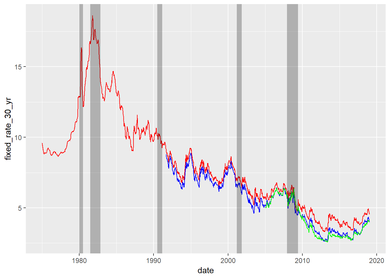
Relationship between housing growth and mortgage rates
Here we do cross-correlation of US average HPI and fixed rate 30 year mortgage rates. We use tidy data munging, but then let the base R ccf function do the hard work. Because the mortgage rate is sparse, we use the na.locf function to fill in values from the last non-missing observation.
state_hpi %>%
  left_join(mortgage_rates %>% select(date, fixed_rate_30_yr), by = "date") %>%
  na.locf() ->
  hpi_and_mort

hpi_and_mort %>%
  filter(state == "AK") %>% # using average, which is same for all states, so arbitrary
  select(date, us_avg, fixed_rate_30_yr)  ->
  us_hpi_mort

with(us_hpi_mort, ccf(us_avg, fixed_rate_30_yr, main = "CCF of US avg HPI and 30 year fixed rates"))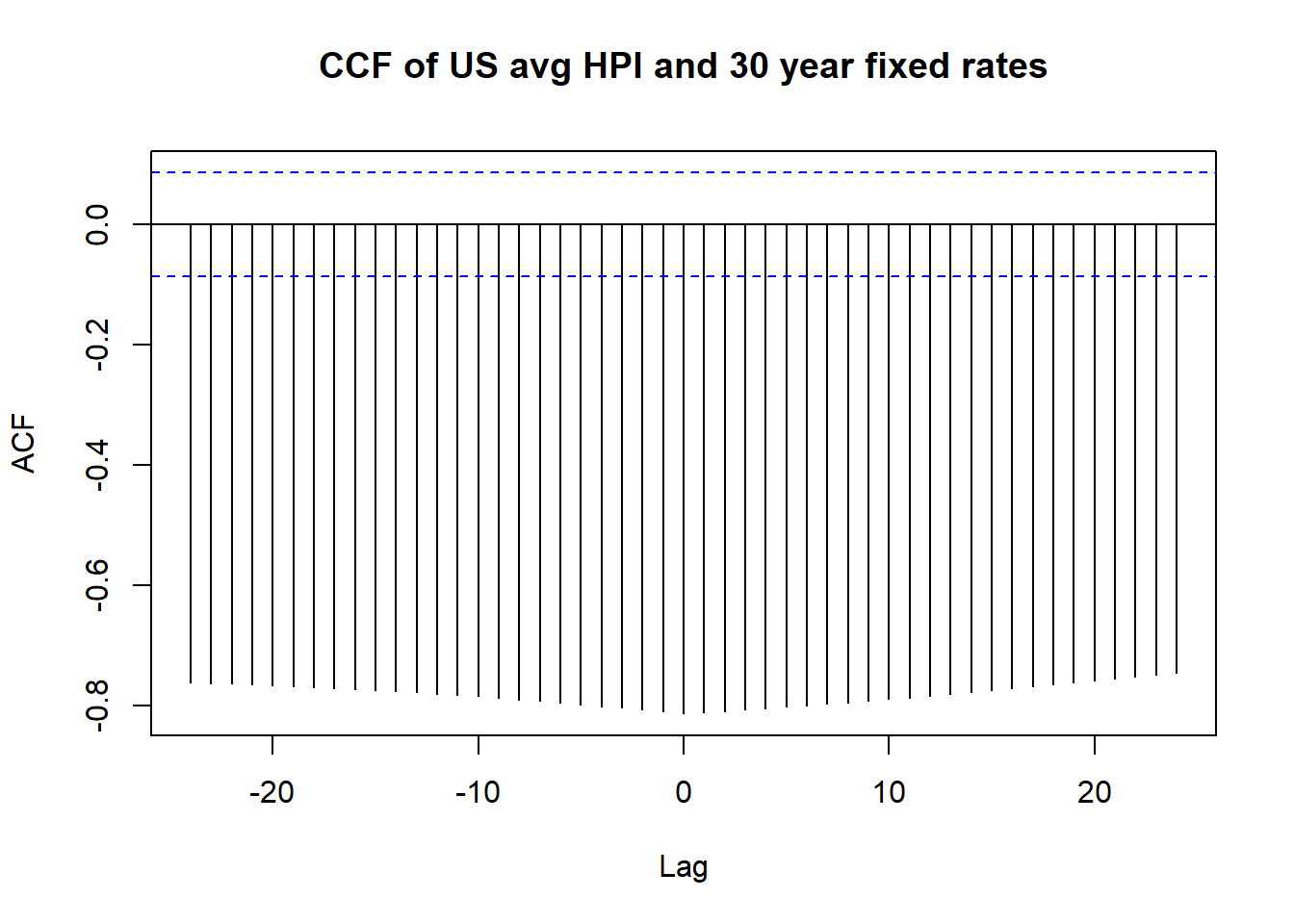
The fact the cross-correlation function is so large in magnitude shows the persistence of relationships over a few years, showing that this information can be exploited perhaps in some prediction of housing or interest rates.
Partial Autocorrelation of fixed 30 year rates
Here we start to get into modeling of time series. Because the CCF above suggested a long-range dependence, I decided to check if there is some partial autocorrelation. Autocorrelation is just the correlation of the value at time \(T\) and \(T - t\). Partial autocorrelation removes the correlation of the value at \(T\) and \(T - s\) from the correlation of the values at \(T\) and \(T - t\), where \(s \le t\). Basically, we are trying to remove any confounding effect of intervening time periods. Here is the result, with the base R pacf doing the heavy lifting:
with(us_hpi_mort, pacf(fixed_rate_30_yr, main = "ACF of 30 year fixed rates"))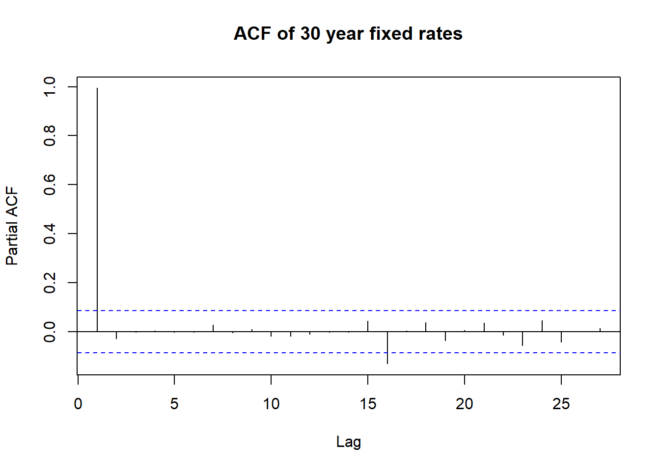
This is not too surprising, because in most cases the interest rate is exactly the same as the predecessor because of the filling in of missing data. We test if the time series is stationary using the augmented Dickey-Fuller test from the tseries package.
with(us_hpi_mort, adf.test(fixed_rate_30_yr))##
## Augmented Dickey-Fuller Test
##
## data: fixed_rate_30_yr
## Dickey-Fuller = -2.8577, Lag order = 8, p-value = 0.2153
## alternative hypothesis: stationaryThe series is not stationary, meaning the relationship between interest rates at some lag in time changes over time. Let’s go to work, using the auto.arima function from the excellent forecast package. An advantage of using this particular function is that the folks at Business Science have created the tk_ts, timetk, and sweep packages to make this function work in a tidy way. But first:
fix30 <- auto.arima(us_hpi_mort$fixed_rate_30_yr)
summary(fix30)
## Series: us_hpi_mort$fixed_rate_30_yr
## ARIMA(0,1,0)
##
## sigma^2 estimated as 0.08941: log likelihood=-109.85
## AIC=221.7 AICc=221.71 BIC=225.95
##
## Training set error measures:
## ME RMSE MAE MPE MAPE
## Training set -0.007790596 0.2987219 0.07540171 -0.1748321 0.9617707
## MASE ACF1
## Training set 0.9983033 0.002579079So we have to use an ARIMA(0,1,0) model, which is probably the simplest non-stationary model. The “untidy” way of showing the forecast is simple enough:
plot(forecast(fix30, h=12))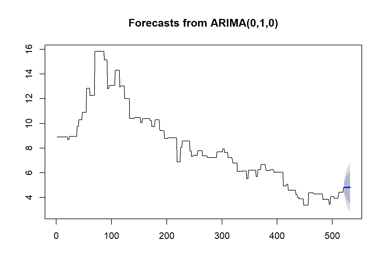
Forecasts the tidy way
Here are forecasts for mortgage rates and housing growth, using the auto.arima function from the forecast package. I admit to ripping a little bit of this code from David Robinson’s dairy presentation.
us_hpi_mort %>%
  gather(indicator, value, -date) %>%
  nest(-indicator) %>%
  mutate(ts = map(data, tk_ts, start = 1975.666666666, frequency = 12, deltat = 1/12))  %>%
  mutate(model = map(ts, auto.arima),
         forecast = map(model, forecast, h=60)) %>%
  unnest(map(forecast, sw_sweep)) ->
  forecast_df
## Warning in tk_xts_.data.frame(ret, select = select, silent = silent): Non-
## numeric columns being dropped: date
## Warning in tk_xts_.data.frame(ret, select = select, silent = silent): Non-
## numeric columns being dropped: date## Warning in bind_rows_(x, .id): Vectorizing 'yearmon' elements may not
## preserve their attributes
## Warning in bind_rows_(x, .id): Vectorizing 'yearmon' elements may not
## preserve their attributesforecast_df %>%
ggplot(aes(index, value)) +
geom_line(aes(color = key)) +
geom_ribbon(aes(ymin = lo.80, ymax = hi.80), alpha = 0.25) +
geom_ribbon(aes(ymin = lo.95, ymax = hi.95), alpha = 0.5) +
facet_wrap( ~ indicator, scales = "free_y") +
expand_limits(y = 0) +
scale_color_discrete(guide = "none") +
xlab("Year")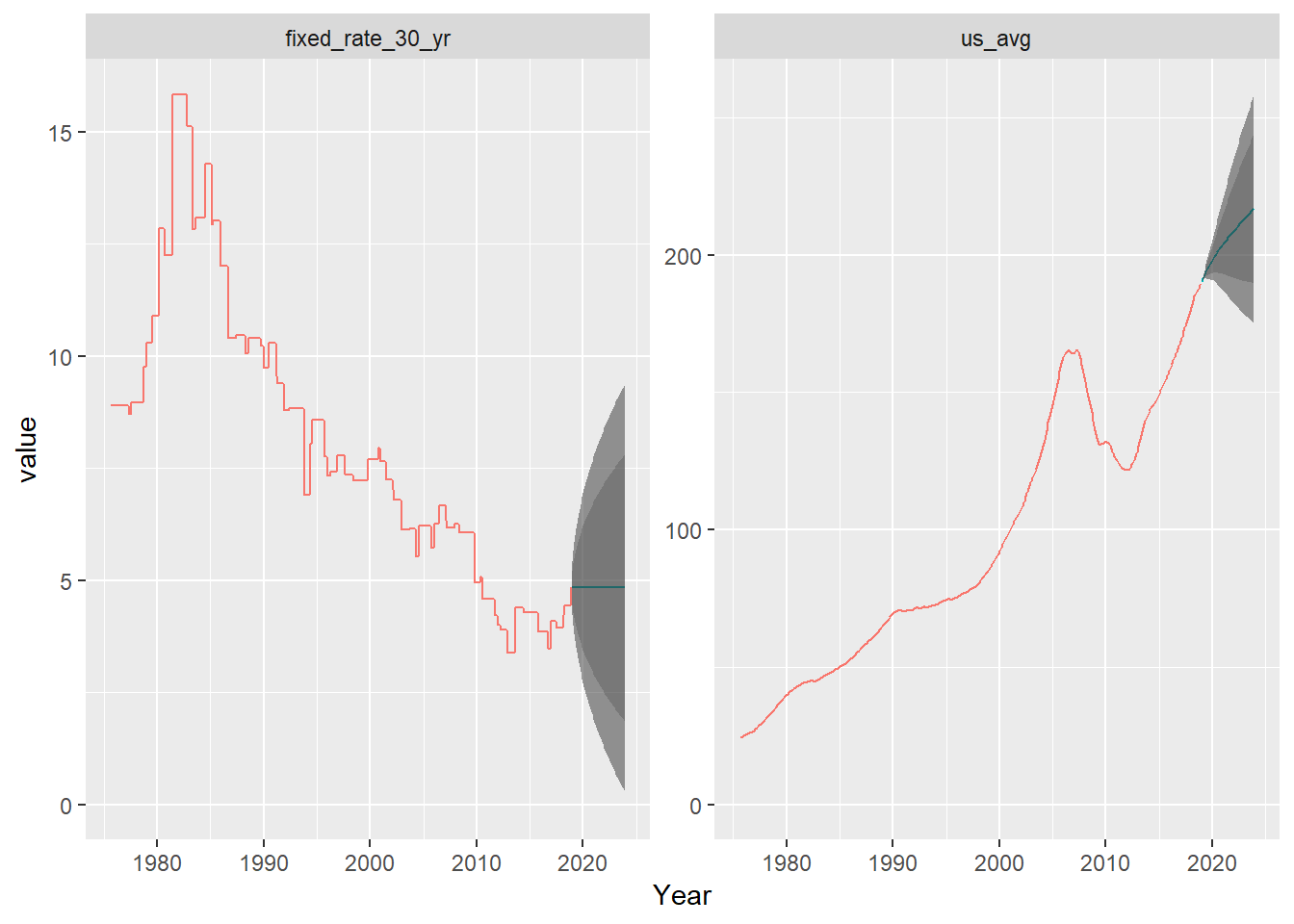
The predictions give a wide range for interest rates (starting to include 0), but are rather flat. Housing is projected to continue growing, though could stall out.
A word about this graph. In this particular case, I probably should have produced them separately, without the faceting. These things are on different scales, and the y-axis means different things in both cases. Just think about how you would re-label the axes.
If I were not doing a blog post but rather trying to explore this for professional purposes, I’d dig into this a bit more, perhaps by pulling related data from FRED. The cross-correlation function shown above does suggest that one might be used to predict the other, so if there were some more sophisticated way of predicting mortgage rates, for instance (perhaps by using sentiment analysis on Fed statements, for instance), you can use that to predict housing price growth.
Relationship between housing growth and mortgage, revisited
Here, rather than looking over time, we visualization the US avg HPI and mortgage rates on a scatterplot:
us_hpi_mort %>%
  ggplot(aes(fixed_rate_30_yr, us_avg)) +
  geom_point() +
  geom_smooth(method = "lm", se = FALSE)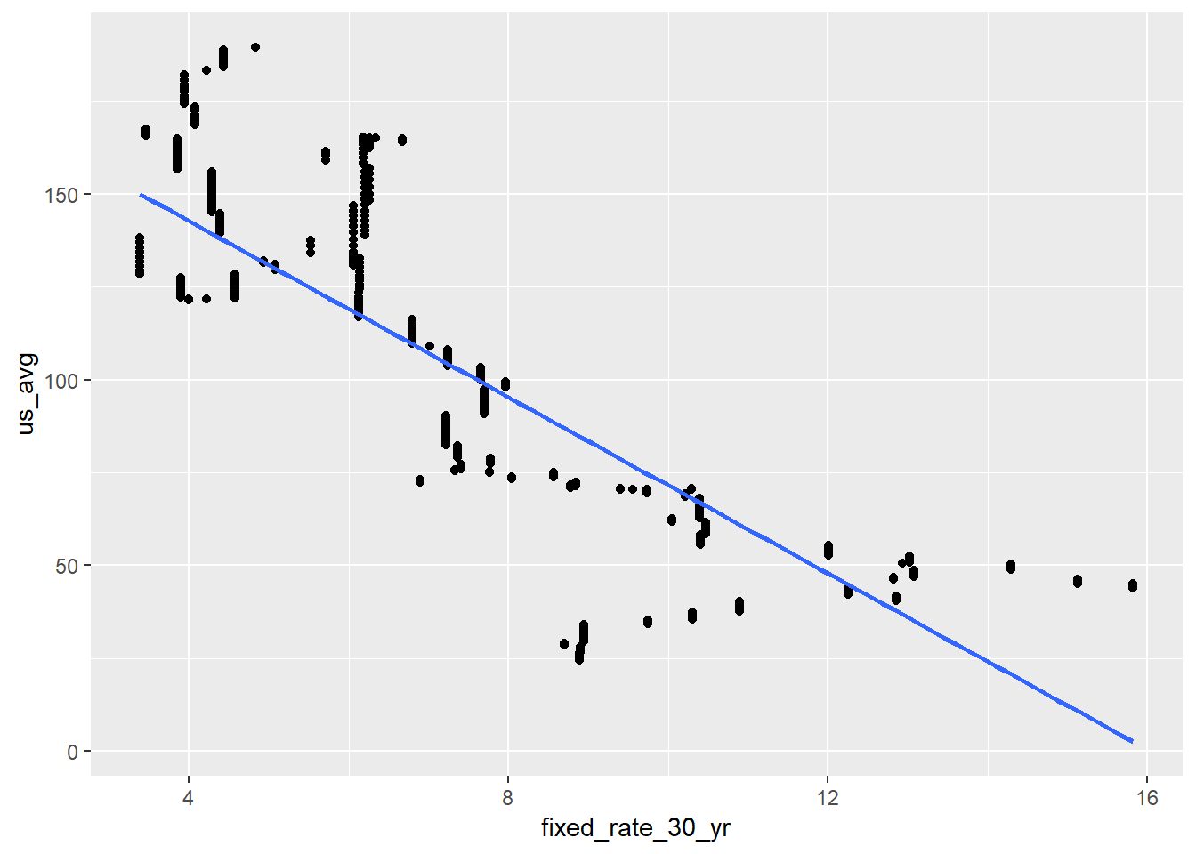
Those fixed 30 year rates to the right of the plot are going to prove troublesome. These are the extremely high rates from the 80s.
Now we do a regression of US avg HPI on mortgage rates:
hpi_mort_lm <- lm(us_avg ~ lag(fixed_rate_30_yr), data = us_hpi_mort)
summary(hpi_mort_lm)
##
## Call:
## lm(formula = us_avg ~ lag(fixed_rate_30_yr), data = us_hpi_mort)
##
## Residuals:
## Min 1Q Median 3Q Max
## -60.511 -14.953 -0.281 15.064 53.741
##
## Coefficients:
## Estimate Std. Error t value Pr(>|t|)
## (Intercept) 190.5045 3.2441 58.72 <2e-16 ***
## lag(fixed_rate_30_yr) -11.8700 0.3731 -31.82 <2e-16 ***
## ---
## Signif. codes: 0 '***' 0.001 '**' 0.01 '*' 0.05 '.' 0.1 ' ' 1
##
## Residual standard error: 26.58 on 517 degrees of freedom
## (1 observation deleted due to missingness)
## Multiple R-squared: 0.662, Adjusted R-squared: 0.6613
## F-statistic: 1012 on 1 and 517 DF, p-value: < 2.2e-16I’m worried here that the hi-leverage points from the 1980s mortgage rates are throwing things off. I’ll try a robust linear model (p. 100 from Faraway).
library(MASS)##
## Attaching package: 'MASS'## The following object is masked from 'package:dplyr':
##
## selecthpi_mort_rlm <- rlm(us_avg ~ fixed_rate_30_yr, data = us_hpi_mort)
summary(hpi_mort_rlm)##
## Call: rlm(formula = us_avg ~ fixed_rate_30_yr, data = us_hpi_mort)
## Residuals:
## Min 1Q Median 3Q Max
## -60.7262 -15.2312 -0.2793 14.7623 57.2668
##
## Coefficients:
## Value Std. Error t value
## (Intercept) 188.3950 3.2546 57.8866
## fixed_rate_30_yr -11.6205 0.3745 -31.0283
##
## Residual standard error: 22.24 on 518 degrees of freedomI’m still not too happy with this. The hi-leverage points from the 80s seem to really be screwing things up, and the robust method in rlm works with heavy-tailed residual distributions. There clearly is some relationship, but I think there are a couple of things obscuring the situation:
- The hi-leverage points
- The overall growth of the economy
Because MASS interferes with dplyr and I don’t need it any more, I remove it (and get select back).
detach("package:MASS")The effect of recessions
Here I want to determine whether a particular time point is during a recession. Then I will add that to the visualization above. We do this by using a crossing and then filtering on whether a date is between from and to:
recession_dates %>%
  select(from, to) %>%
  mutate(is_recession = TRUE) ->
  recession_join

us_hpi_mort %>%
  crossing(recession_join) %>%
  filter(date >= from & date <= to) ->
  us_hpi_rec

us_hpi_mort %>%
  left_join(us_hpi_rec %>% select(date, is_recession)) %>%
  mutate(is_recession = if_else(is.na(is_recession), FALSE, is_recession)) ->
  us_hpi_mort_rec
## Joining, by = "date"Now that we’ve determined whether we’re in a recession, we can show the relationship again, with color-coding:
us_hpi_mort_rec %>%
  ggplot(aes(fixed_rate_30_yr, us_avg)) +
  geom_point(aes(color = is_recession)) +
  geom_smooth(method = "lm", se = FALSE)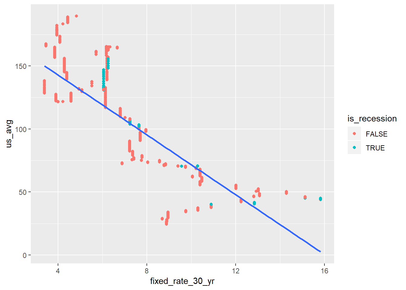
There doesn’t look to be a lot there, but then again we haven’t spent a lot of time in recession. Let’s look at two separate lines now. This time I added the color = is_recession to the original ggplot call so that both geom_point and geom_smooth will interit this mapping.
us_hpi_mort_rec %>%
  ggplot(aes(fixed_rate_30_yr, us_avg, group = is_recession, color = is_recession)) +
  geom_point() +
  geom_smooth(method = "lm", se = FALSE)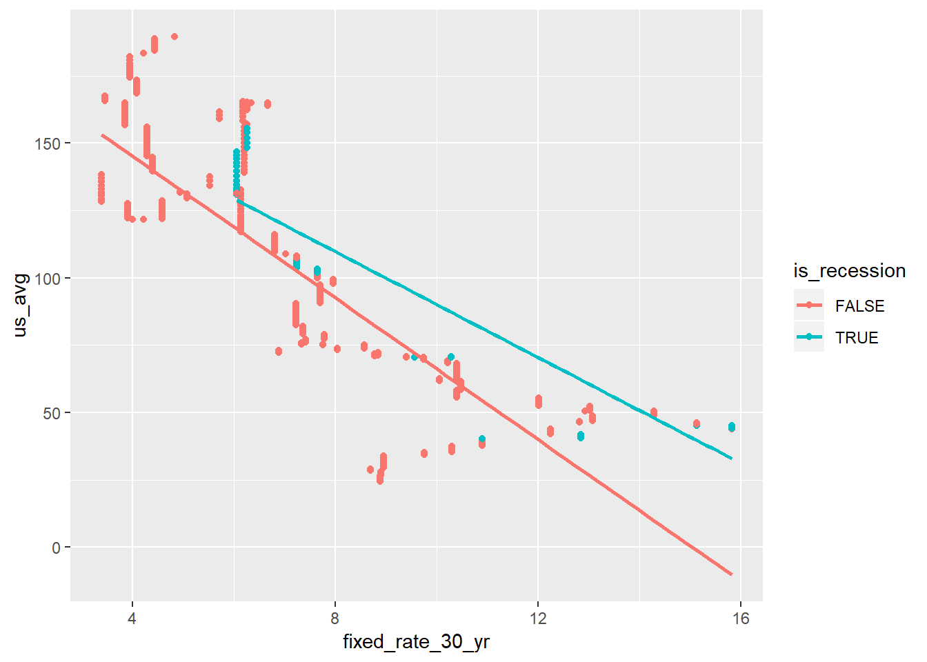
There’s a small hint on a change in relationship between housing growth in the US and mortgage rates in recessions.
By state relationships
The true power here is to recreate the above analysis by state all at once. I’m only going to use four states: DC, HI, SC, and CA. Three are interesting, and one is perhaps more interesting to me than others.
We basically replicate the above steps, but use map extensively. We can also re-use recession_join above to determine whether a US recession is going on. What might be more interesting is to get by-state recession data, but that’s not what we have here. Because I’m looking at two variables, and I’m crossing a large dataset with another one, I cut down on memory usage a bit by selecting a small number of variables. I can also just use the original price index here; it will not affect the analysis.
my_states <- c("DC", "HI", "SC", "CA")

hpi_and_mort %>%
  select(date, state, price_index, fixed_rate_30_yr) %>%
  filter(state %in% my_states) ->
  hpi_and_mort_2

hpi_and_mort_2 %>%
  crossing(recession_join) %>%
  filter(date >= from & date <= to) ->
  us_hpi_rec

hpi_and_mort_2 %>%
  left_join(us_hpi_rec %>% select(date, is_recession), by = "date") %>%
  mutate(is_recession = if_else(is.na(is_recession), FALSE, is_recession)) ->
  hpi_mort_rec
Now we can do the same as above, but add a facet_wrap to look at individual states.
hpi_mort_rec %>%
  ggplot(aes(fixed_rate_30_yr, price_index)) +
  geom_point(aes(color = is_recession)) +
  geom_smooth(method = "lm", se = FALSE) +
  facet_wrap( ~ state)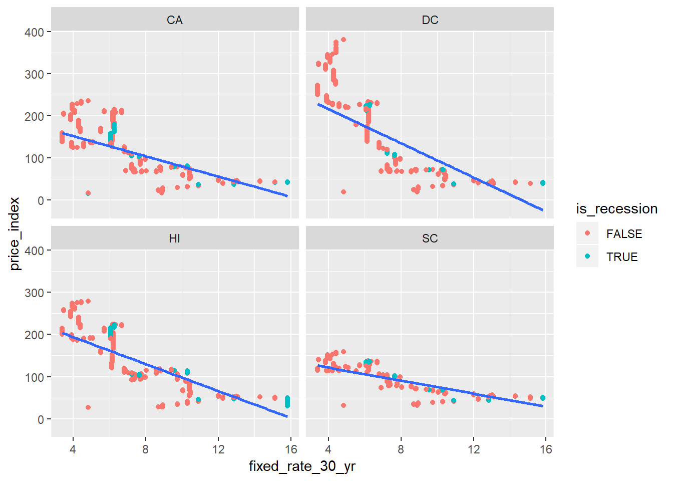
You can see the relationship between housing and mortgage rates (30 year fixed) differ by state. Perhaps those states with high housing price growth to begin with are more sensitive to interest rates, and this makes sense.
Finally, lets see the change in relationship during recessions:
hpi_mort_rec %>%
  ggplot(aes(fixed_rate_30_yr, price_index, group = is_recession, color = is_recession)) +
  geom_point() +
  geom_smooth(method = "lm", se = FALSE) +
  facet_wrap( ~ state)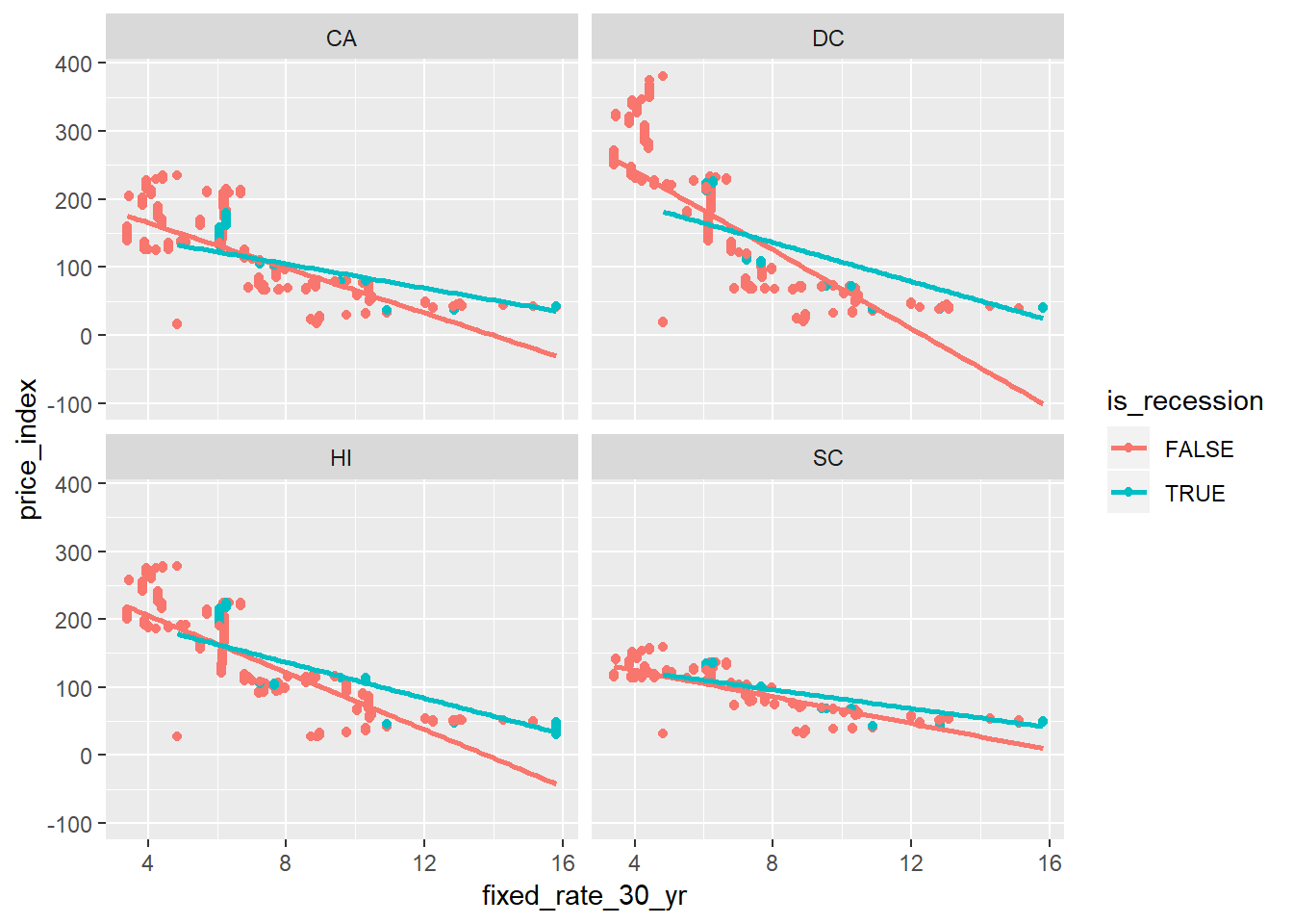
Again, it looks like places with higher growth are more sensitive to recessions. It’s a hypothesis worth exploring.
Well, that’s a wrap for this week, although now that I’m getting more interested in economic data I’ll probably look at this some more.