French train delays (Tidy Tuesday Feb 26, 2019)
Purpose
The purpose of this post is to explore the French train dataset for Tidy Tuesday, Feb 26, 2019.
Setup
Data
I use the col_types option of read_csv to force the reading of comments as character. I think the issue is that they are so sparsely populated in the records that the parser “guesses” they are logicals from all the NAs.
trains_raw <- readr::read_csv("https://raw.githubusercontent.com/rfordatascience/tidytuesday/master/data/2019/2019-02-26/full_trains.csv", col_types = cols(comment_cancellations = col_character(), comment_delays_at_departure = col_character()))Clustering
If you look at the original post (and you should; there’s a lot of good stuff), it looks like percentage delays spike seasonally for some stations, but not others. Others may have a different pattern. While the tile plots are interesting, they do leave us with a lot of questions. One is what are the patterns of lateness. For example, are there some trains to avoid in the summer (maybe because of all the tourists) but are ok in the winter?
There are a couple of ways to go about this. The one I will use is to create an observation for each station with variables as months, and the percent late departure as values. I’ll then use principal components analysis to reduce this large number of variables into an appropriate amount (small enough to work with, large enough to be expressive). Finally, I’ll use a clustering algorithm.
Data prep
First, to turn the data into a format suggested by the above.
trains_raw %>%
  transmute(link = map2_chr(departure_station, arrival_station, ~paste(.x, .y, sep = "-")),
            frac_late = (num_of_canceled_trains + num_late_at_departure) / total_num_trips,
            month_cat = map2_chr(year, sprintf("%02d",month), ~paste("mon",.x,.y, sep = "_"))) %>%
  spread(month_cat, frac_late, fill = 0) ->
  trains_frac_late

datatable(trains_frac_late %>% mutate_if(is.numeric, ~format(.x,digits=2)))
Honestly, I forgot on the first time around that I couldn’t use paste without map (or whatever appropriate variant), so it took me a moment to get here, but now the data is in the format I want.
Anyway, technically this is most untidy because I’ve encoded two variables into column names. But part of knowing the rules is knowing when you have to break them.
Principal components analysis
Principal components analysis (PCA) is a dimension reduction technique that determines the directions of greatest magnitude of data. It is very helpful it you have a lot of variables that are of the same kind – for example, fraction late for a lot of different months. This is why I “broke” the “tidy data” rules above. I’m converting all these variables into just a few variables that presumably will have be meaningful for clustering. So on with it.
This is my first experience using the tidy modeling part of the tidyverse suite of tools. PCA turns out to be a part of the recipes package, which is described as “preprocessing tools to create design matrices”. Basically it is a data preparation package for advanced modeling, and PCA is often used as a preprocessing step, as I’m about to do here. So here we go.
For the recipes package, first we have to specify the steps, then bake them. This is because data preprocessing is often a series of steps, such as centering and scaling, PCA, or other analysis. Here we’ll want to do centering and scaling as well, so let’s take full advantage. I basically rip off code from the step_pca page and add in my own dataset. I decided to remove the center and scale.
rec <- recipe( ~ ., data = trains_frac_late)
pca_trans <- rec %>%
  step_pca(all_numeric(), threshold = 0.9)
pca_estimates <- prep(pca_trans, training = trains_frac_late)
pca_data <- bake(pca_estimates, trains_frac_late)

tidy(pca_estimates, number = 1) %>%
  head(10)
## # A tibble: 10 x 4
## terms value component id
## <chr> <dbl> <chr> <chr>
## 1 mon_2015_01 -0.0590 PC1 pca_yj8JY
## 2 mon_2015_02 -0.0700 PC1 pca_yj8JY
## 3 mon_2015_03 -0.0535 PC1 pca_yj8JY
## 4 mon_2015_04 -0.0762 PC1 pca_yj8JY
## 5 mon_2015_05 -0.0737 PC1 pca_yj8JY
## 6 mon_2015_06 -0.0819 PC1 pca_yj8JY
## 7 mon_2015_07 -0.103 PC1 pca_yj8JY
## 8 mon_2015_08 -0.0920 PC1 pca_yj8JY
## 9 mon_2015_09 -0.0770 PC1 pca_yj8JY
## 10 mon_2015_10 -0.0750 PC1 pca_yj8JYThere are 2 principal components that explain 90% of the variation in lateness over the months. Often, the first principal component represents something close to the mean, but that doesn’t seem to be the case here. Let’s see a scree plot.
ggplot(pca_data, aes(PC1, PC2)) +
  geom_point() +
  labs(title = "PCA of fraction late over time by station, 2016 - 2018")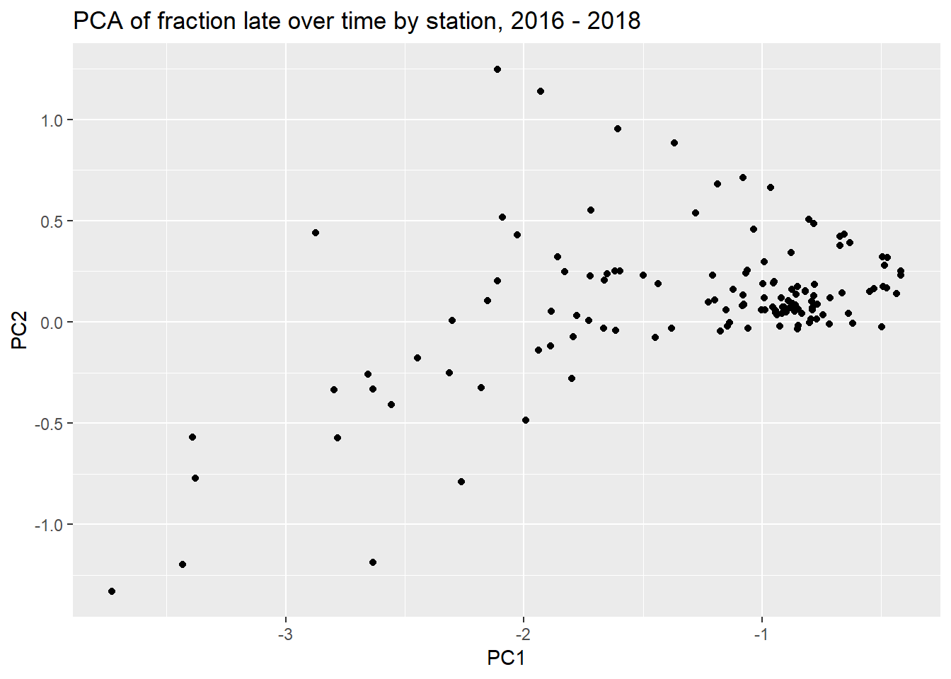
Usually the PC1 represents something obvious, like the mean lateness.
The first two components as time series look like this:
tidy(pca_estimates, number = 1) %>%
  filter(component %in% c("PC1", "PC2")) %>%
  mutate(date = ymd(str_sub(paste(terms,"_01",sep=""), 5))) %>%
  ggplot(aes(date, value, group = component, color = component)) +
  geom_line() +
  xlab("Date") + ylab("")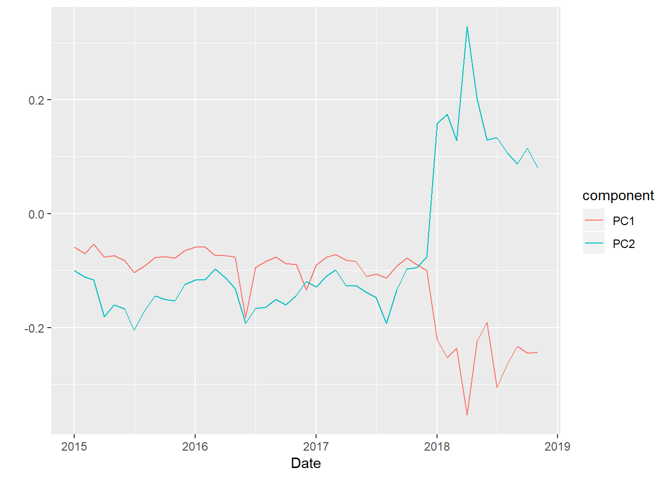
So the first component acts like a mean from 2015 through 2018, but then drops in 2018, perhaps in contrast to PC2. PC2 spikes in 2018. It looks like stations high in PC2 would be have been impacted more by the 2018 strikes.
If this way of doing things strikes you as odd, it’s because the recipes infrastructure is intended for machine learning, where you would define training and test sets. Preprocessing steps (prep) can depend only on the training data, but applied (bake) on both training and test sets. We’re not going to use the full power of that infrastructure in this post.
Clustering
Given the way the scree plot (PC2 on PC1) turned out, I’m not sure there’s going to be a lot to the clustering, but let’s forge ahead.
pca_data %>%
  select(-link) %>%
  as.matrix() %>%
  `rownames<-`(pca_data$link) %>%
  dist(method = "euclidean") ->
  cl_dist

cl_clus <- hclust(cl_dist)

cl_clus %>%
  as.dendrogram() %>%
  ggdendrogram(rotate = TRUE, size = 0.25)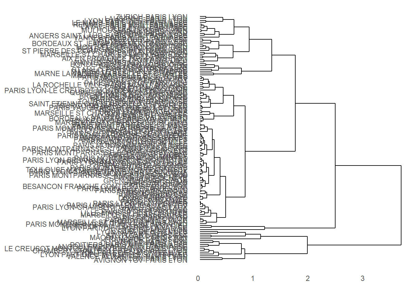
That’s a bit of a mess, and, honestly, it’s going to be tough to make this pretty because of all the different routes. Let’s see if we can identify links in clusters and plot as colors on the scree plot.
members <- cutree(cl_clus, k = 3)

members %>%
  data.frame(cluster = .) %>%
  rownames_to_column(var = "link") ->
  membership_df

membership_df %>%
  right_join(pca_data) ->
  augmented_pca
## Joining, by = "link"## Warning: Column `link` joining character vector and factor, coercing into
## character vectorggplot(augmented_pca, aes(PC1, PC2)) +
geom_point(aes(color = factor(cluster))) +
labs(title = "PCA of fraction late over time by station, 2016 - 2018")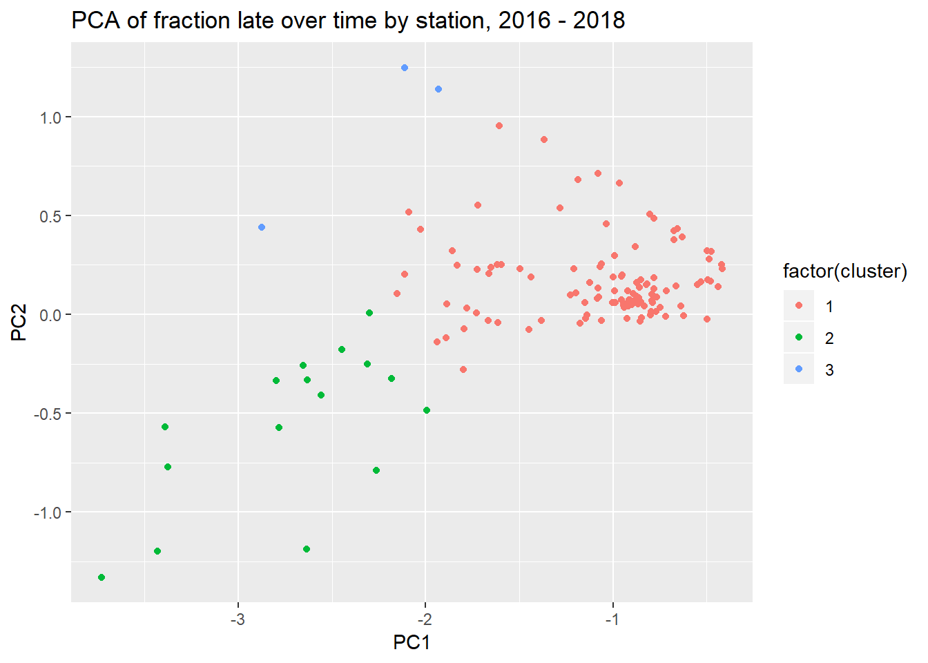
You can play with the number of clusters, if you want, or you can try something like k-means clustering. What we also might try to do is use the membership to show lateness over time.
trains_frac_late %>%
  left_join(membership_df) %>%
  mutate(cluster = factor(cluster)) %>%
  group_by(cluster) %>%
  summarize_if(is.numeric, mean) %>%
  gather(terms, frac_late, -cluster) %>%
  mutate(date = ymd(str_sub(paste(terms,"_01",sep=""), 5))) %>%
  ggplot(aes(date, frac_late, group = cluster, color = cluster)) +
  geom_line() +
  ylab("Fraction late") + xlab("Date")
## Joining, by = "link"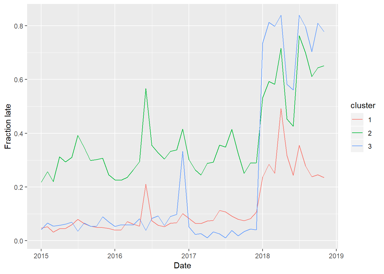
So Cluster 1 consists of the more on-time trains, and Cluster 2 consists less on-time trains. Cluster 3, which consists of only 3 links, were generally on time until the strikes of 2018, in which case they were thrown way off schedule.
Discussion
This is a very rich dataset, and this analysis only scratches the surface of what you can do with it. There’s data on whether arrivals are late and cause of delays, and the above analysis can easily be repeated. It’s probably worth exploring other number of clusters (3 above) or other methods. You could also probably also do this without PCA, but it would be harder to visualize.