Analyzing Stan output
Purpose
The purpose of this post is to introduce you to analyzing Stan output. We started doing this in the last post by printing out the results of the fit object returned by the stan() function. rstan provides further functions to analyze the output, both for diagnostics and inference.
Setup and data
We use the mean_model_fit object from before. Recall we had saved it.
library(rstan)
library(bayesplot)
load("mean_model_fit.RData")
Analysis
Trace plots
Stan uses a method that is a type of Markov chain Monte Carlo (MCMC). A Markov chain is a sequence where the distribution of a random variable at a given position, say \(n\), in the sequence is conditionally independent of the random variable at position \(n-2\) given that the variable at \(n-1\) is observed. So, in a sense, if we want to predict the next observation in the chain, all we need is the current one, as the past won’t give us any more information. The MCMC methods have been a breakthrough in Bayesian analysis because they have made it possible to simulate from posterior distributions in even complex problems. The drawback is that assessing the convergence of these chains is complex, and diagnosing and troubleshooting lack of convergence is more difficult.
With that in mind, the first graph we might look at is the traceplot. A traceplot can tell us how well the sample is exploring the space of the posterior distribution. If we have several plots from several chains (Stan does 4 by default) that seem to be noisy and overlap, that’s a good indication that the chains have converged to the posterior distribution.
Let’s use the bayesplot package to examine the traceplot of our simple example.
p <- mcmc_trace(as.matrix(mean_model_fit),pars=c("mu","sigma"),
                facet_args = list(nrow = 2, labeller = label_parsed))
p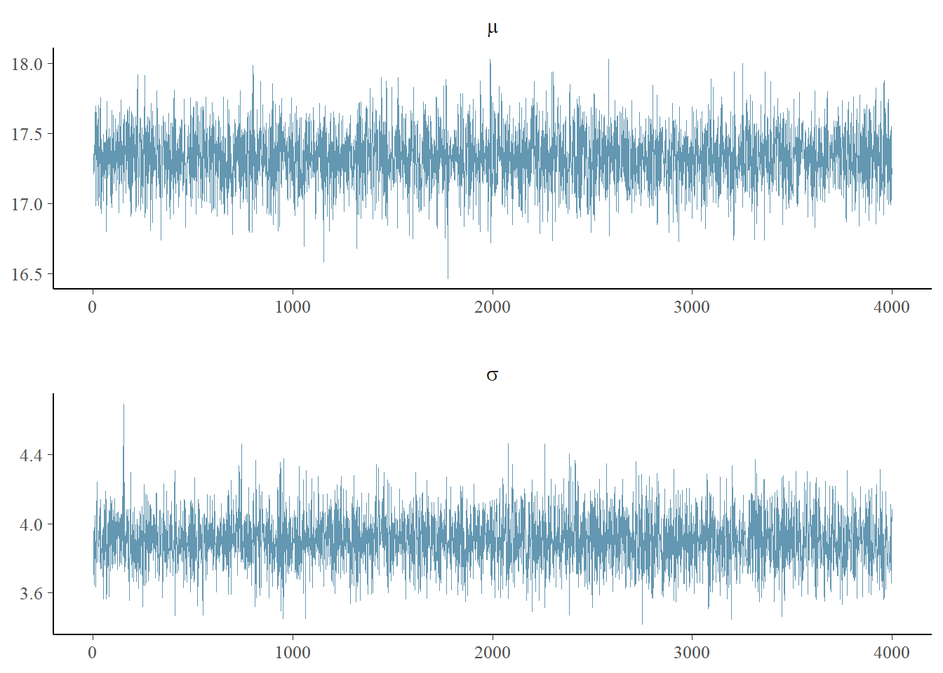
This is only somewhat helpful. One of the issues is that we used the defaults of stan, which is 2000 iterations with a “warmup” or “burnin” (i.e. discarded) of 1000 iterations. Thus, we have a total of 4000 iterations in our simulation, and they are shown above as a single chain.
Instead, we’d like to see the 4 chains overlaid.
p <- mcmc_trace(as.array(mean_model_fit),pars=c("mu","sigma"),
                facet_args = list(nrow = 2, labeller = label_parsed))
p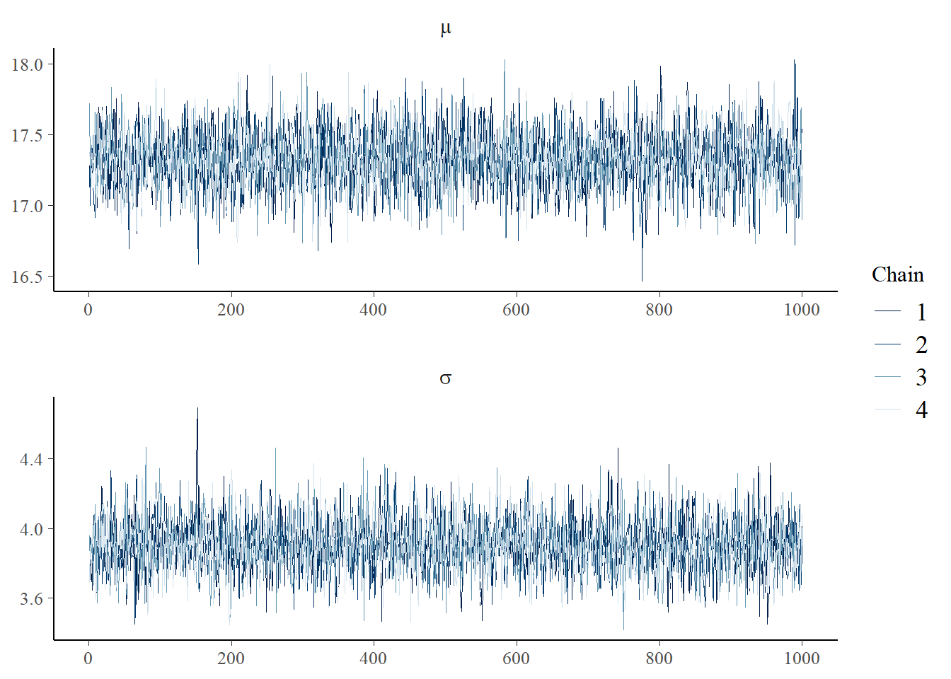
This is a lot better. The difference is we use as.array, which keeps the structure of the 4 chains, as opposed to as.matrix, which basically lays all 4 chains end-to-end and returns a single matrix.
There are a couple of things we used to make this plot fancier. ggplot2 has a faceting facility that mcmc_trace exploits, and this label_parsed options turns our mu and sigma into \(\mu\) and \(\sigma\). We got a little fancy.
Interpreting the trace plot
These trace plots are well-behaved. They basically look like random noise jumping around a relatively constant number. The chains are all on top of each other and look like they are drawn from the same distribution. We expect this from the simple model we ran. As we run more complicated models, we will explore other options of mcmc_trace that will help diagnose problems.
When things go wrong, there are many ways the trace plot might not look like the above. It might look like a noisy sine wave (we say that the chain is not “mixing” well - and Stan’s underlying algorithm - often alleviates this issue). It might jump between two noisy states, or simply go from one to the other for a short time and then jump back. The chains might not overlap.
When running more complicated models, Stan may have a problem with “divergent transitions” - we’ll cover this later and also explore some of the options of mcmc_trace that help diagnose this issue.
Density plots
Density plots are both a good diagnostic and inferential tool. Basically, bayesplot’s mcmc_areas function is the equivalent of running plot(density(x)) on all the parameters of a fit, with some tools to easily pretty up the graph. In this case, because we are drawing inference on all the samples and don’t need the individual chains any more, we will use as.matrix function rather than as.array.
p <- mcmc_areas(as.matrix(mean_model_fit),pars=c("mu","sigma"),prob = 0.5) +
  ggtitle("Posterior distributions with medians and 50% intervals")
p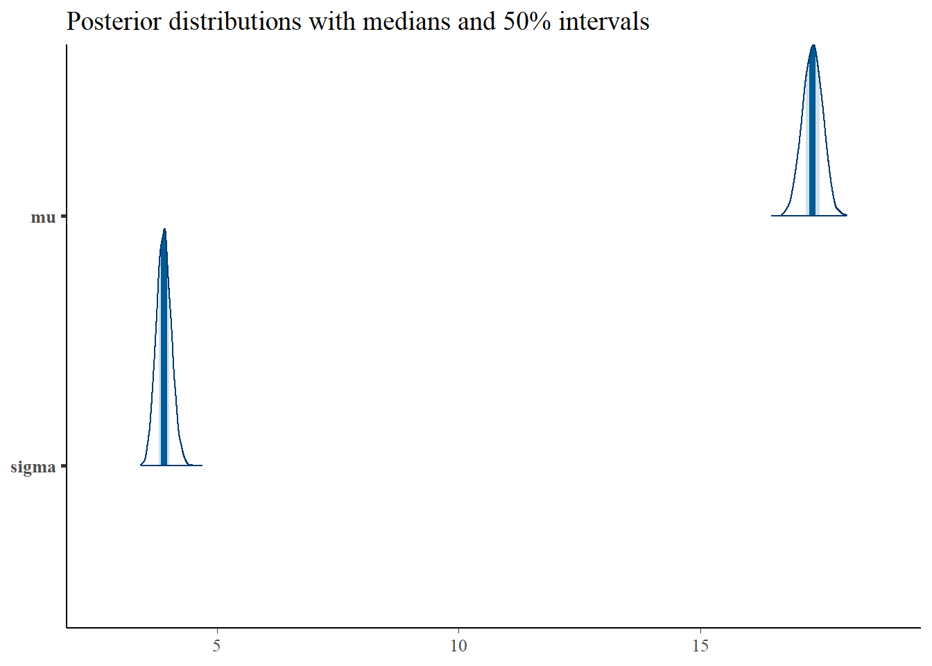
The title pretty much gives the interpretation of this plot, assuming that our simple mean model is close to the actual data generating mechanism. In fact, you can interpret the 50% intervals as probability statements on \(\mu\) and \(\sigma\) (the way we’d like to do with the classical confidence intervals, but shouldn’t).
Shinystan
It’s probably useful to introduce the shinystan package as well. This package is best run using RStudio, because it creates an interactive webpage that depends on RStudio’s shiny package for interactive, R-backed web pages. The shinystan package, despite the name, ought to be able to work with just about any MCMC package (including WinBUGS and OpenBUGS called from R), but has functionality designed specifically for Stan. You can interactively diagnose fits with a single command.
Discussion
We broached the topic of diagnosing Stan output through looking at diagnostic graphics. It’s always a good idea to get a visual representation of output from any MCMC simulation before proceeding to inference. The shinystan package, which provides interactive diagnostics, was introduced.
Next time we return to making models a little more sophisticated and finding ways to exploit the patterns we saw in the flight data.